Typography
For full notes, please see handouts.
Categories of Type
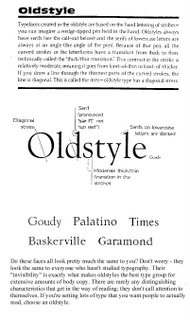
Oldstyle

Slab Serif
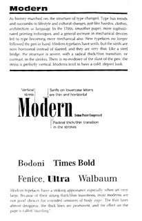
Modern
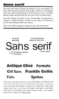
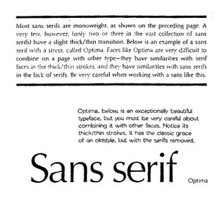
San Serif
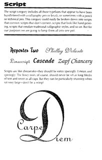
Script
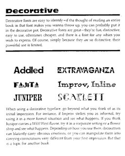
Decorative
The Point System
Points
• 72 points (pts.) to the inch in height, 36pts = 1/2", 18 pts = 1/4”
• used for measuring type size
• refers to the height of the capital letters
General Rules
• do not use more than 2 typefaces in an ad or document
• do not use more than 1 headline face or body copy face
• the types you use should be either very similar (harmony) or very dissimilar (contrast)
• for readability, headlines are often sans-serif and body text is serif, avoid all caps, and use even spacing
• the bigger the type face, the wider the column
• 39 characters of lowercase letters, break long portions of text into columns
• flush left is usually easier to read because letter spacing is more even
• fully justified is often used in books and newspapers
• flush right is usually used for small portions of text
• never ad extra kerning to copy - only use kerning on short headlines or subheadlines of one or two words
• centered is most often used for headlines
• avoid punctuation in headlines
• avoid capitalizing each word in headlines - only capitalize the first word or proper names
• using all lower case on headlines and subheads associates the company or product with creativity
• be careful with word emphasis and end of lines
• the negative letter space is important to appearance and readability
Type Mood
What emotion and association does a font suggest?
For full notes, please see handouts.
Categories of Type

Oldstyle
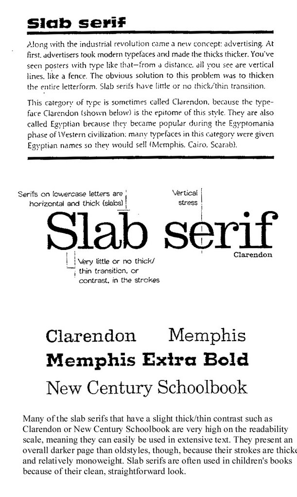
Slab Serif

Modern


San Serif
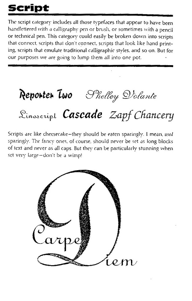
Script
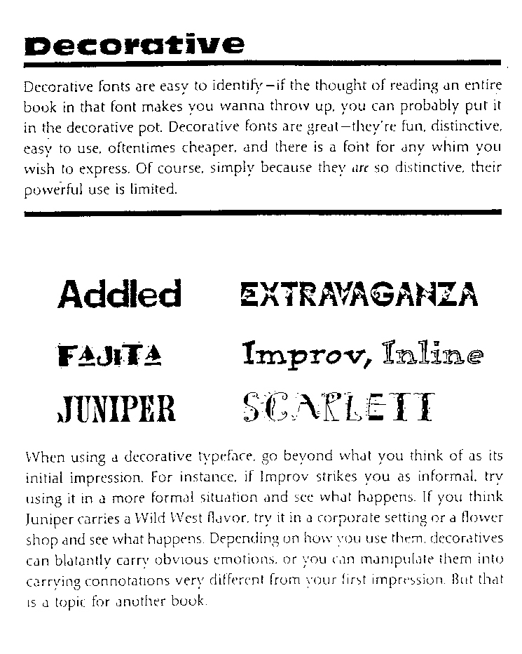
Decorative
The Point System
Points
• 72 points (pts.) to the inch in height, 36pts = 1/2", 18 pts = 1/4”
• used for measuring type size
• refers to the height of the capital letters
General Rules
• do not use more than 2 typefaces in an ad or document
• do not use more than 1 headline face or body copy face
• the types you use should be either very similar (harmony) or very dissimilar (contrast)
• for readability, headlines are often sans-serif and body text is serif, avoid all caps, and use even spacing
• the bigger the type face, the wider the column
• 39 characters of lowercase letters, break long portions of text into columns
• flush left is usually easier to read because letter spacing is more even
• fully justified is often used in books and newspapers
• flush right is usually used for small portions of text
• never ad extra kerning to copy - only use kerning on short headlines or subheadlines of one or two words
• centered is most often used for headlines
• avoid punctuation in headlines
• avoid capitalizing each word in headlines - only capitalize the first word or proper names
• using all lower case on headlines and subheads associates the company or product with creativity
• be careful with word emphasis and end of lines
• the negative letter space is important to appearance and readability
Type Mood
What emotion and association does a font suggest?
posted by MJ at 1:45 PM


0 Comments:
Post a Comment
<< Home