Monday, September 25, 2006

Barbara Kruger


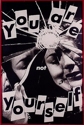
After attending Syracuse University, the School of Visual Arts, and studying art and design with Diane Arbus at Parson’s School of Design in New York, Barbara Kruger obtained a design job at Condé Nast Publications. Working for Mademoiselle Magazine, she was quickly promoted to head designer. Later, she worked as a graphic designer, art director, and picture editor in the art departments at House and Garden, Aperture, and other publications. This background in design is evident in the work for which she is now internationally renowned. She layers found photographs from existing sources with pithy and aggressive text that involves the viewer in the struggle for power and control that her captions speak to. In their trademark black letters against a slash of red background, some of her instantly recognizable slogans read “I shop therefore I am,” and “Your body is a battleground." Much of her text questions the viewer about feminism, classicism, consumerism, and individual autonomy and desire, although her black-and-white images are culled from the mainstream magazines that sell the very ideas she is disputing. As well as appearing in museums and galleries worldwide, Kruger’s work has appeared on billboards, buscards, posters, a public park, a train station platform in Strasbourg, France, and in other public commissions. She has taught at the California Institute of Art, The School of the Art Institute of Chicago, and the University of California, Berkeley. She lives in New York and Los Angeles.

Take note of how Kruger uses a combination of artwork and text - her text is not a straightforward interpretation of the image. Instead, it creates a sometimes ambiguous relationship with the image. Through the use of both evocative statements and imagery, the viewer contemplates the relationship between the two.



Friday, September 22, 2006

Collage

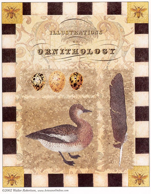
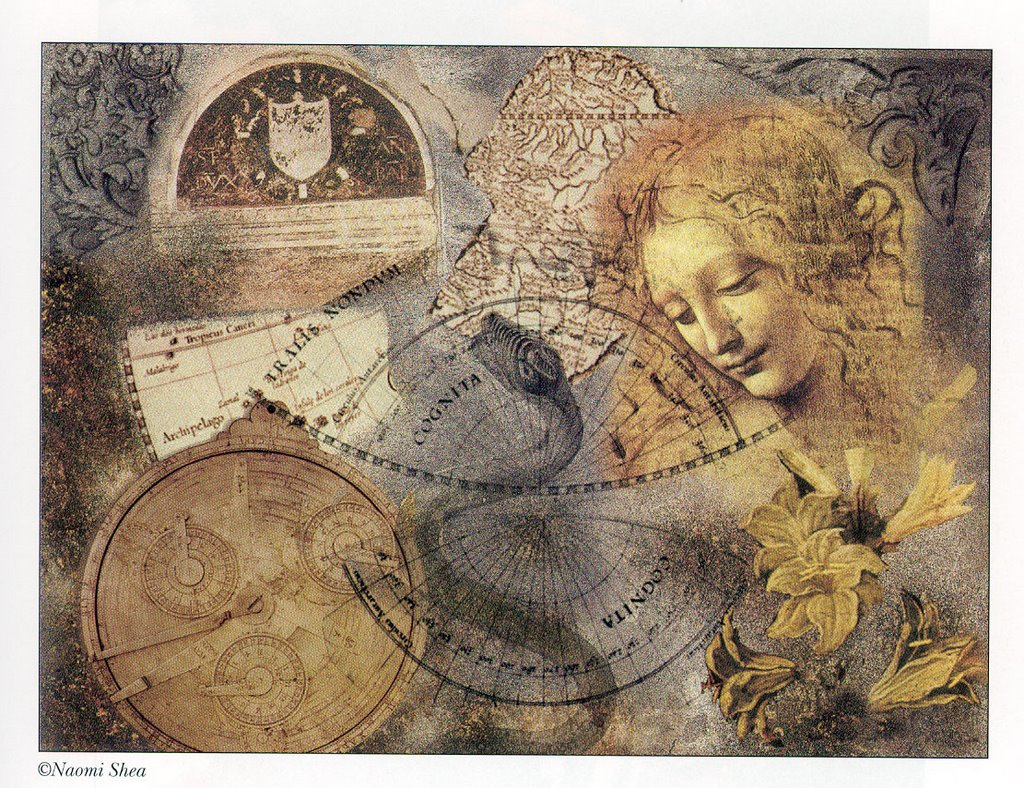
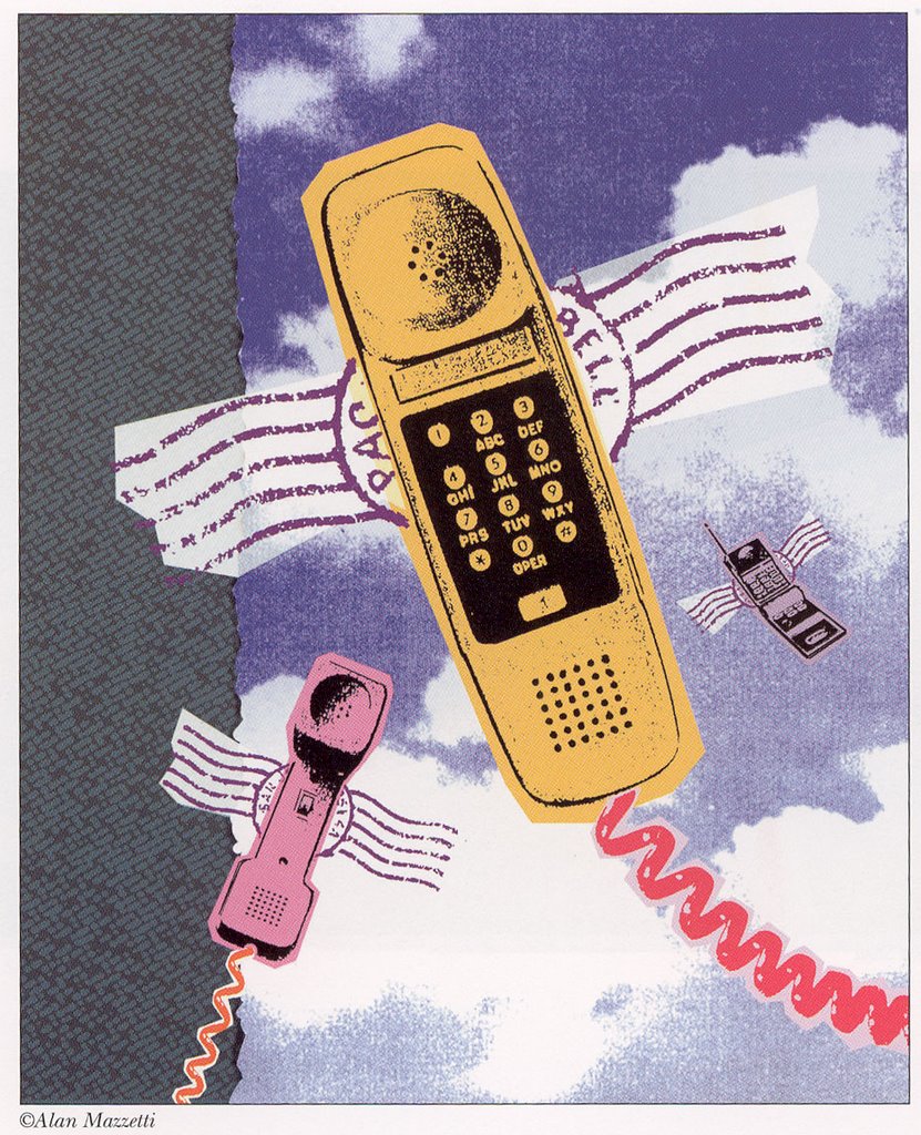
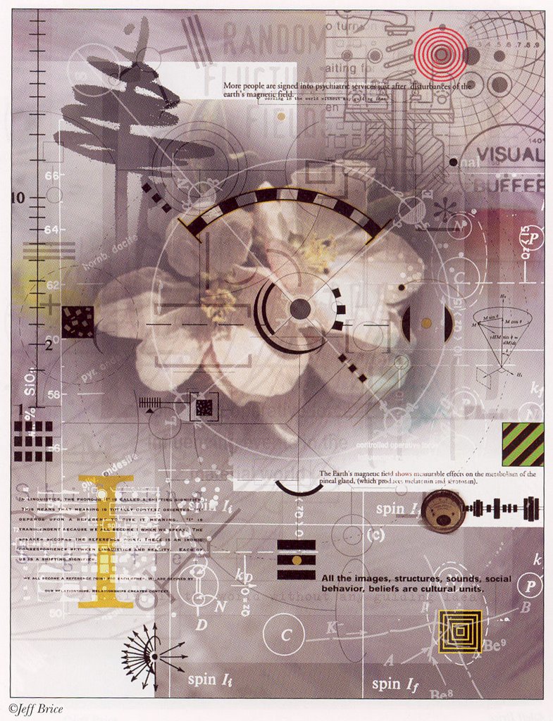
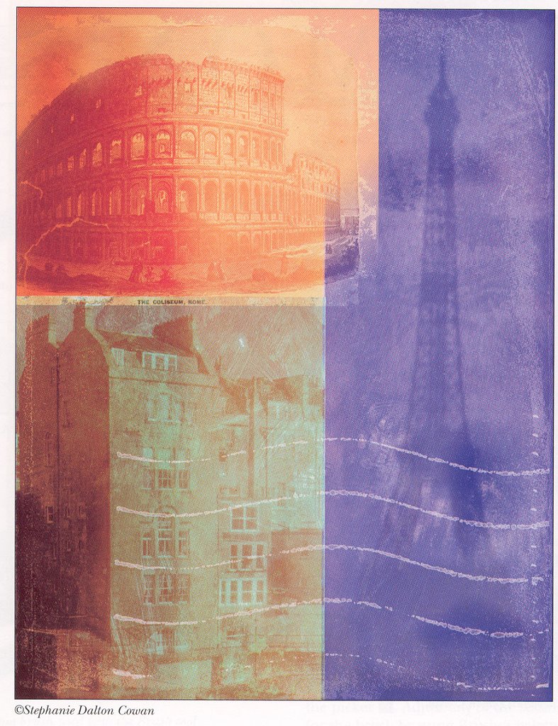
Collage (From the French, coller, to stick) is regarded as a work of visual arts made from an assemblage of different forms, thus creating a new whole. Read the Wikipedia information on collage.

Photomontage, Digital collage


Digital collage is the technique of using computer tools in collage creation to encourage chance associations of disparate visual elements and the subsequent transformation of the visual results through the use of electronic media. Take a look at Collage for information, in particular Photomontage.

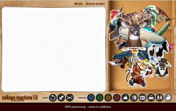
Try creating your own collage with the Collage Machine.


Alejandro Puga - a Surrealist collage artist


Cubist painter, Pablo Picasso, invented the collage technique in 1912 with his Still Life with Chair Caning (Nature-morte à la chaise cannée), in which he pasted a patch of oilcloth with a chair-cane design to the canvas of the piece.


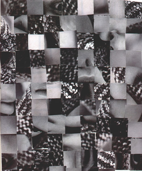
Cubomania is a method of making collages in which a picture or image is cut into squares and the squares are then reassembled without regard for the image.

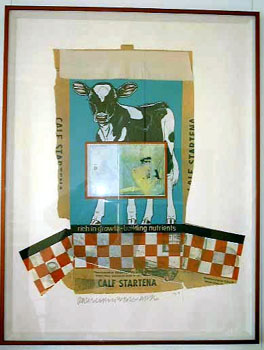
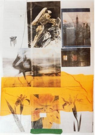
Robert Rauschenberg

By 1962, Rauschenberg's paintings were beginning to incorporate not only found objects but found images as well--photographs transferred to the canvas by means of the silkscreen process. Previously used only in commercial applications, silkscreen allowed Rauschenberg to address the multiple reproducibility of images, and the consequent flattening of experience that that implies. In this respect, his work is exactly contemporaneous with that of Andy Warhol, and both Rauschenberg and Johns are frequently cited as important forerunners of American Pop Art.


Thursday, September 21, 2006

Photoshop: Paths


Here is an online video demonstration of how to use Photoshop Paths. I highly recommend that you take a look at them all.

Photoshop Paths

You will need Windows Media to view them.

Cropping Exercise Using Paths


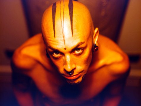
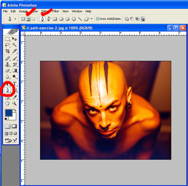
Often you will want to crop out a background, or cut out an object from a photograph. This exercise shows you how. You are going to draw a path around the object - in this case, a bald man. Once the path is drawn, then you will change the path into a "selection," and then inverse the selection, and delete the background.

Instructions:


Begin by selecting your Paths Tool. On the context-specific bar on the top, select the "Paths" option, and make sure the "Pen Tools" option is also selected (see red check marks on image).


With your Pen Tool, click to make your Beginning Point of the curve. Click & drag to create the handle bar of your curve - position it half way in between the beginning point and where your end point will go. Let go of your cursor, and then click to make your end point. You have created a curve.


To adjust the arc of your curve, press CTRL and your cursor will turn into an arrow, or pointer. Using the point on the point of the handle bar, move it until the curve fits closely against the object you are drawing around.


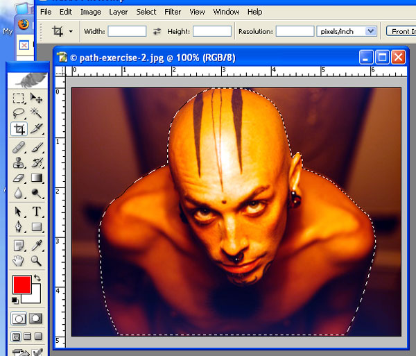
To continue the next curve, click on the End Point and drag. This will join the first section of the path to the second section you are creating. Then click an end point. Adjust your curve, and continue. Continue all the way around the object until you have created a CLOSED path - the path should join into one.


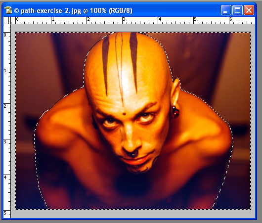
Using your Layers Floating Palette, select the PATHS TAB. You will see the path that you created. Using the small arrow on the palette, click to get the pulldown menu, and the select "Make Selection." This turns your path into a selection. Notice that what is selected is the object - not the background.


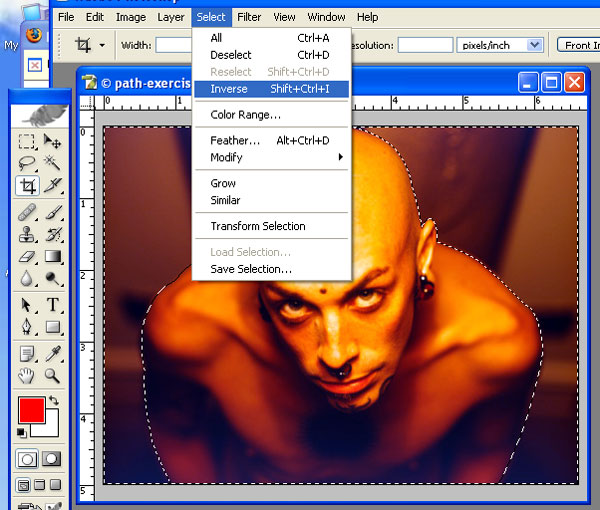
To select the background, you must INVERSE the selection. Go to the SELECT Pulldown Menu, and selection INVERSE. Now notice that the selection area is the background.


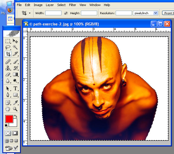
To delete the background, first make sure that your background colour on your Tool Bar is set to white. Then press "DELETE" on your keyboard.


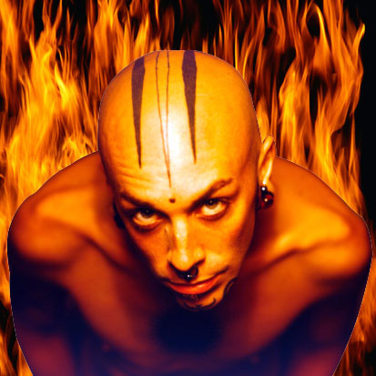
On the other hand, you could copy the figure/object (and not the background) and paste him on top of another photo. In this instance, I've used a fire background.

Wednesday, September 20, 2006

Elements and Principles of Design
Wednesday, September 20, 2006


These are some of the notes from our class presentation. For the full notes, use class handouts.

Form follows function
The physical properties of the object or the elements used in the design reflect its meaning, use and purpose.

7 Elements of design


Line: Line can be considered in two ways. The linear marks made with a pen or brush or the edge created when two shapes meet.


Shape: A shape is a self contained defined area of geometric or organic form. A positive shape in a painting automatically creates a negative shape.

Direction: All lines have direction - Horizontal, Vertical or Oblique. Horizontal suggests calmness, stability and tranquility. Vertical gives a feeling of balance, formality and alertness. Oblique suggests movement and action.

Texture: Texture is the surface quality of a shape - rough, smooth, soft, hard, glossy, etc. Texture can be physical (tactile) or visual.


Color: Color or the absence of it is significant in your choice of elements.

Size: The fifth element is size, which is how big or small something is. In design, size can can attract or size can organize. Sometimes size is also called “mass.”

Tonal Contrast: Tonal contrast is simply the difference between the light and dark areas in a painting. The greater the difference the more attention the area attracts.

5 Design Principles

1. Balance
The design must be in balance – have an equal distribution of visual weight. Balance in design is similar to balance in physics. A large shape close to the center can be balanced by a small shape close to the edge. A large light toned shape will be balanced by a small dark toned shape (the darker the shape the heavier it appears to be).

Two kinds of balance:
Formal (symmetrical): Fold your page in half, vertically. If one side mirrors the other, than it is symmetrical balance. It communicates stability, seriousness, the classical and trustworthiness. In advertising, it's often used for institutional and other serious-minded advertising.

Informal (assymetrical): Optical weights are balanced (check in mirror to see if one side is balanced with the other). It can communicate creativity, contemporary, unique, playfulness and originality.


In advertising, the space within the ad should be broken up into pleasing proportions. This relates to the size, shape, and weight of elements to one another. There should be a balance between consistency and variety. Use the 1:3 rule.

2. Emphasis
One element (or one part of an advertisement), should dominate all others.
What one item must be emphasized? (The art, headline, copy block, logo?)
How much emphasis should it get?

Create emphasis by using these rules:
a. Our attention is attracted to first to dark elements, and then to light elements;
b. From unusual shapes to usual or geometric shapes (our brain is attracted to biomorphic shapes before geometric shapes);
c. From colour elements to non-colour elements.

3. Direction
A directional pattern should be evident. In advertising, left to right, top to bottom
designer leads the reader by hand through the maze of the advertisement (artwork, headline, logo, body copy, contact information).


4. Rhythm
Created by repeating or varying elements, giving consideration to the space in between them, which establishes a sense of movement from one element to another.
Repetition and variation is key.

5. Unity
A unifying force should hold the ad together. In advertising, a border or white space is often used.

Tuesday, September 19, 2006

Creative Strategy

1. Medium|Media Description:
Describe the medium/media used in the construction of your piece (digital photography, specific software, scanning, stock photography, drawing, etc.) What are some of the assumptions inherent about the medium/media used?

2. Type of Artwork:
Self-Portrait, Collage, Web Site, Video, Animation, etc.

3. Research other artists and artworks to get informed and inspired.
Using the library (books, magazines, periodicals, exhibition catalogues) or the internet, research artists/designers approaches to the type of artwork/design you are doing. Decide upon a stylistic approach that you would like to use, and photocopy or print at least three examples of artwork/design that are done in this style. Write a paragraph or two about the artist(s) and the stylistic approach.

4. Executional Considerations:
What do you need to produce the artwork? For example - digital or traditional camera, software, resolution requirements, measurements of final piece, models, settings, scanning, deadline for project, etc.

5. Creative Process:
Write a paragraph or two about how you arrived at your final image. What were some of the emotional, technical and creative challenges, surprises and insights?

6. Meaning:
What is the implied message behind your choice of the elements of your design? Describe the meaning of your images, colors, layout and font choices. What is the overall theme to your artwork?

7. How is emotional and/or intellectual involvement achieved?
What creates emotional and or intellectual involvement in your artwork? What emotional or intellectual reaction do you intend to trigger in your viewer?

8. How does your artwork have visual impact?
What makes your choice of artwork or visual elements stand out and provoke attention?

9. How does the presentation of your artwork, affect its meaning or reception by the viewer?
Your choices of glossy or matt paper, size, mounting and framing all affect the message of your artwork. What does your presentation communicate?

10. What is the title of your artwork?
Is it important to understanding the piece, irrelevant or intentionally ambiguous?
Photoshop Project 1: Self-Portrait
15% of Final Grade


The self-portrait is a time-honoured artistic endeavour with a rich history. You will research artistic approaches by other artists who have constructed self-portraits, settle upon your own stylistic approach, and using Photoshop, create your own. The final project will be professionally printed and presented for grading and a constructive class critique.

When you hand in your project, it will contain:

1. Creative Strategy (30% of grade)

• Using the outline given by the instructor, complete all points.
• Using the library (books, magazines, periodicals, exhibition catalogues) or the internet, research artists approaches to the self-portrait. Decide upon a stylistic approach that you would like to use, and photocopy or print at least three examples of self-portraits that are done in this style.
• Write a paragraph or two about the artist(s) and the stylistic approach
• Write a paragraph or two about your creative process (how you arrived at your final image) in constructing your own self-portrait.
• Describe whether or not the work expresses an aspect of yourself, and why or why not.
• Professionally type and present your Creative Strategy report. Use 11 point type, with 15 points of line space. Pay attention to spelling and grammar.
• Title your artwork (or call it “Untitled”).

2. Self Portrait | Artwork (70% of grade)

• Print and professionally present your artwork - use either glossy or matt paper, mount or frame
• Make sure that the resolution of your piece is between 144-300 ppi, and it is an appropriate size
• Demonstrate some proficiency with Photoshop
• Make sure your artwork is completed in a consistent visual style
• Follow the principles of design
• Make available the Photoshop file in your personal folder on NMED2020(B)’s class folder on the “S:” drive

Review the Project 1 Marketing Sheet for details on how you will be evaluated. This will be handed out in class.

Monday, September 18, 2006


Interesting Self-Portraits

dr Wahur: Complication

This image used two different digital images taken with his camera, which were then pasted into one Photoshop file, and parts of them erased and blended, creating a surrealist effect. It suggests a Dr. Jekyll and Mr. Hyde psyche.

Sunday, September 17, 2006

Colour, Resolution, File Formats
Monday, September 18, 2006


These are just a few of the notes from our class. Refer to your handouts for the full presentation.

Colour appeals to emotions, and has a more immediate impact


Monotones appeal more to the intellect and require more intellectual interaction by the reader (such as fine art photography using black and white or duotone images)


Copy: In this wonderful game, white and black always have been together. Stop racism.

Spot colour is used to highlight (information). In a black and one colour advertisement or image, use colour sparingly and only to highlight (a few key messages)


CMYK – Reflective Colour
Cyan, magenta, yellow, black - when printed on white paper create nearly the full spectrum of colours


CMYK is the standard for print

CMYK and Image Resolution
Because CMYK is used for print, the image resolution must be very high
> PPI (pixels per inch) or DPI (dots per inch) refer to the number of pixels per inch in a digital image
> For magazine ads use 300 ppi (150 line screen)
> For newspaper ads use 200 ppi (100 line screen)
> File formats for images used print are “.tif”, “.eps”

RGB – Luminescent Colour

Red, green and blue create the full spectrum of colour in luminescent colour
One common application of the RGB color model is the display of colors on a cathode ray tube, liquid crystal display or plasma display, such as a television or a computer's monitor. Each pixel on the screen can be represented in the computer or interface hardware (for example, a 'graphics card') as values for red, green and blue. These values are converted into intensities which are then used for display.

RGB and Image Resolution

> Because RGB is used for monitors, the resolution is low
> The maximum resolution monitors can show is 72 ppi (dpi)
> High definition television monitors will use more
> File formats for images used on the internet are “.jpg” or “.gif”
> Prepress does not allow the use or RGB images because they do not separate correctly to CMYK

Print Resolution Guides
72 ppi = 72 dpi - Photographs and graphic will look poor on any paper.
100 ppi = 100 dpi - Photographs and graphics will be acceptable on plain paper; however, printed on high quality paper will reveal flaws
144 ppi = 144 dpi - Photographs and graphics have to be very closely scrutinized to reveal flaws on any paper.
300 ppi = 300 dpi - Photographs and graphics printed at this resolution and will not reveal flaws that can be attributed to resolution
700 ppi = 700 dpi - Photographs and graphics printed at this resolution will look identical to those printed at 300 dpi. The added size of the file will not improve the quality of the image.

Color Wheel


> The color wheel shows the relationship of colors. There are three primary colors (red, blue, yellow)
> Three secondary colors which are the result of mixing primary colors (purple, orange, green)
> And the tertiary colors which are a primary color mixed with a secondary color such as red-orange, yellow-green and blue-violet
> When they colors are mixed with pure colors white or black it creates numerous different tints and shades

TERMS TO KNOW
> Hue: Another name for color
> Tint: Color + White
> Tone: Color + Grey
> Shade: Color + Black
> Value: The lightness or darkness of a color

Photoshop: Colour Mode


Under the IMAGE pulldown menu, select MODE, and you’ll see what colour mode your image is by the one that is check-marked


Here you can also make it a different colour MODE, such as CMYK, RGB, Grayscale and Indexed Color (used for .gifs)

Photoshop: Resolution (Image Size)
Under the IMAGE pulldown menu, select IMAGE SIZE… and you’ll see a dialogue box showing you information about your image size


Pixel Dimensions: the size of the image file
Width & Height: shown in both pixels and inches
Resolution: shows how many pixels/inch the image is

Photoshop: Selecting Pantone Colours
On your floating Colour Palette, click and hold on the small arrow on the top right hand side, and select Pantone Process Colors

Saturday, September 16, 2006

Photo-Editing Techniques for Portraits

NOTE: If you run into problems with my explanations, always check your Photoshop Visual Quickstart Guide textbook, or the "HELP" pulldown menu in Photoshop.


The professional graphic designer edits digital portraits before publishing them, in order to improve the appearance of the individual and put their "best face forward." Here are some common techniques used to improve portraits.

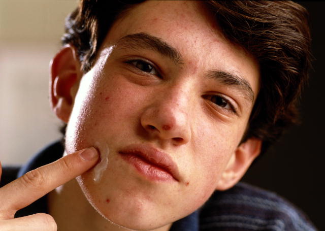
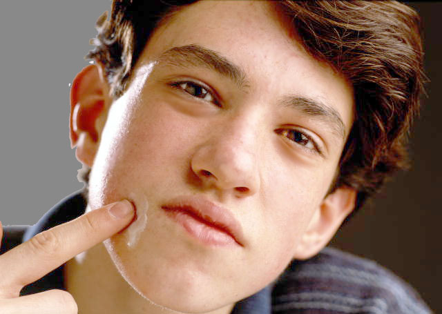
In class, we used this image of a teenage boy with acne.


The picture is quite dark and requires more midtones and brightness. So the first thing to do is to change the Image Levels.

Image Levels
In Photoshop with the image open, go to the Image pulldown menu, and select "Adjustments." First try "Auto Levels." This usually works for most photos, but if there are no changes to the image, or it makes the image look worse, then do the following...

Go to the Image pulldown menu, and select "Levels." You will see a graph depicting the dark, medium and light portions of the image. Usually if you pull the middle arrow icon to the left, it will brighten the mid-tones, making the image look better. Sometimes you will need to pull the left arrow icon to the right to make it darker, or the very right arrow icon to the left to make the white areas of the image brighter. Often it is a combination of these - experiment with them until you see an image that balances the dark tones, mid-tones and white-tones of the image. In this instance, I pulled the mid-tones to the left, making them brighter.

Healing Brush (Bandaid Icon) on Tool Bar
To fix the blemishes (pimples) on the model, the Healing Brush tool is used.

Once you've selected the Healing Brush tool, then make sure your brush is an appropriate size, using the context-specific bar across the top. Make the pixel radius of the brush smaller or larger, to get the right size.

Increase the zoom level of your screen (bottom left hand corner) to about 200-400%, so that you can see the detail of the blemish to be removed.

Select an area near the blemish, that is blemish free, and approximately the same colour and value as the area to be corrected. Then press the ALT key, and click in this area, in order to set the area from which the blemish will be corrected. This means that when you click on the blemish with your Healing Brush tool, the sampled area will replace the blemished area. Then through a series of algorithms, Photoshop averages out colour, value, etc. to make the area look as natural as possible, and blend in.

Each time you approach a new blemish to be corrected, select an area that is close to the blemish and is blemish free, ALT click, and then correct the blemish.

Do this until the model is blemish free.

Blur Tool on the Tool Bar
The Blur Tool (it looks like a water droplet) can be used to smooth out skin texture, remove or minimize wrinkles.

Once you've selected the Blur Tool, use the context-specific bar at the top to select an appropriate brush size (pixel radius), "Mode: Normal" and "Strength: 50-100%" to make the changes. The Strength affects how quickly the image area is blurred. If when you try to blur or blend the area and it's going too slowly, then increase the "Strength." This makes the action occur more quickly.

Do this under the eyes, or in any area where you think an area needs to be smoothened. Don't overdo it - it may end up looking unnatural. You may notice that his lips look cracked - blur the areas in his lips to smoothen them somewhat.

The other helpful thing the Blur Tool" can do is lighten areas, while blurring them. So under the eyes, you can lighten the dark circles. Using the context-specific bars across the top, select "Mode: Lighten" - and then move your cursor under the eyes to get a natural looking lightening under the eyes.

The Dodge Tool on the Tool Bar
The Dodge Tool is used to lighten areas, such as the whites of eyes or the teeth. Select the Dodge Tool, then using the context-specific bar on the top, select your brush size, the "Range" - if you're brightened eyes or teeth, the use "Midtones", and how strong the exposure should be. "50%" is usually quite good for this tool.

Then increase the zoom level of your image (using the bottom left hand corner percentage) to about 400%, and click your tool on the white of the eyes. Each time you click, the more it lightens. Try lightening the white reflection in the eye, as well as a bit on the iris. Don't overdo it - make it look natural.

If you make a mistake at any time, using your History Floating Palette, and step backward, until you've restore the image to where you want it.

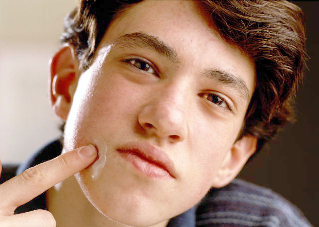
Here's what we've accomplished so far:


Selection Tools
If you want to make areas of the photo a different colour, or delete them altogether, then it's important to know how to use the selection tools. Photoshop has at least 9 tools to do this. We looked at using the Lasso Tool, Polygonal Lasso Tool, the Magnet Lasso Tool and the Magic Wand Tool. Each has it's own attributes and reasons for using them.

Let's take a look at using the Magic Wand Tool. This tool is good for selecting areas that are similar in hue and value, such as the background of the image on the left hand side. The area is a fairly consistent beige/white, and is very different from the area to its right - the edge of the teenager's face.

Selecting the Magic Wand Tool, use the context-specific bar to decide on the "Tolerance" range. The lower the value, the more it will only select pixels of the same hue and value. The higher the value, the more it select pixels of different hue and value. By experimenting, you can find the right range.

In our photo, I've used "Tolerance:32". When I click on the background (left hand side) it only selects the top 1/3 of this area. By holding down the shift key and clicking in the bottom 2/3 I am able to select the entire area.

In order to select more areas, hold down the shift key. You'll notice that your Magic Wand Tool cursor has a + (plus) sign next to it, indicating you're adding additional selected areas. To subtract areas, use the ALT key. It will show a - (minus) sign.

I noticed that the selected area included a part of the ear that shouldn't be selected (by the earlobe), so I zoomed into the image (300%), pressed the ALT key, then clicked with the Magic Wand Tool, and subtracted the area that it had selected. This makes the selection area more correct - it doesn't include part of his face, just the background.

Filling the Background with a Colour
In order to fill the area with a new colour, I use the Floating Swatches Palette. These are on the right hand of the screen. Make sure you select the "Swatches" tab to see the colour swatches. Select one.

You'll notice that on your tool bar, the "Foreground Colour" will change to the selected colour swatch.

Now go to the "Edit" pulldown menu, select "Fill". A dialogue box will ask you "Contents: Fill:" and select "Foreground Colour." There are other options, such as "Background Colour", Black, White and 50% Grey.

Press OK, and the area you have selected with fill with your Foreground Colour.

To DESELECT the area, either press "Ctrl D" (D is for Deselect" or go to the "Select" pulldown menu, and choose "Deselect."

These are the basics that we've covered so far. More next class.