NON-MASTHEAD SITES
The other style of web site you may wish to consider is the non-masthead site. In this instance, the navigational bar is kept very simple, and visual interest is mostly created by adding different images on each page. Take a look at this page from Deric Olsen's web site, promoting his new movie "The Phoenix Agenda." Deric is one of the instructors in New Media, and just completed his Masters in Film Studies at the University of Regina.

Note that his navigational bar is placed underneath the main window. He's used graphic devices to suggest "hi-tech/military/surveillance." Especially take note of what he's done with his rollover buttons - square brackets appear and the rollover text turns blue - a very cool effect, consistent with his theme.
Instead of using html text, he decided to design the entire page using Photoshop - the text is part of the image. While this takes up more downloading time because it is an image, most people use high speed internet, so it isn't a real problem. Also, the window area is not too large, and is kept consistently the same size throughout the site. This is an option you may wish to consider.

Notice the elegant simplicity of the Karacters Design Group web site. No masthead is employed - instead, an animated image changes every few seconds on the right hand side. The text (which is a pixel font) is kept to a minimum, and appears underneath the simple navigational bar.
In terms of using images on your web sites, here are some suggestions:
Keep a consistent theme, such as:
- black and white images of Lethbridge and/or the University
- computer programming related images if you're a programmer
- images of volleyball or skiing, if this is one of your passions
- if you're into art, then use some of your favourite images by other artists.
The options are nearly endless.
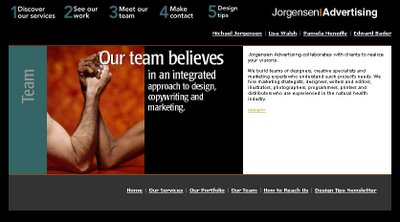
In my old Jorgensen Advertising web site, I used images and words combined. By taking a key phrase and laying it over top of a related image, I was able to emphasize my intended message. On the right hand side I used html text for the copywriting.
While you're studying web sites, take a look at these two main approaches and find one that will work for your target audience(s) and with your thematic approach.
The other style of web site you may wish to consider is the non-masthead site. In this instance, the navigational bar is kept very simple, and visual interest is mostly created by adding different images on each page. Take a look at this page from Deric Olsen's web site, promoting his new movie "The Phoenix Agenda." Deric is one of the instructors in New Media, and just completed his Masters in Film Studies at the University of Regina.

Note that his navigational bar is placed underneath the main window. He's used graphic devices to suggest "hi-tech/military/surveillance." Especially take note of what he's done with his rollover buttons - square brackets appear and the rollover text turns blue - a very cool effect, consistent with his theme.
Instead of using html text, he decided to design the entire page using Photoshop - the text is part of the image. While this takes up more downloading time because it is an image, most people use high speed internet, so it isn't a real problem. Also, the window area is not too large, and is kept consistently the same size throughout the site. This is an option you may wish to consider.

Notice the elegant simplicity of the Karacters Design Group web site. No masthead is employed - instead, an animated image changes every few seconds on the right hand side. The text (which is a pixel font) is kept to a minimum, and appears underneath the simple navigational bar.
In terms of using images on your web sites, here are some suggestions:
Keep a consistent theme, such as:
- black and white images of Lethbridge and/or the University
- computer programming related images if you're a programmer
- images of volleyball or skiing, if this is one of your passions
- if you're into art, then use some of your favourite images by other artists.
The options are nearly endless.

In my old Jorgensen Advertising web site, I used images and words combined. By taking a key phrase and laying it over top of a related image, I was able to emphasize my intended message. On the right hand side I used html text for the copywriting.
While you're studying web sites, take a look at these two main approaches and find one that will work for your target audience(s) and with your thematic approach.
posted by MJ at 1:26 PM


0 Comments:
Post a Comment
<< Home